
Every .NET performance profiling tool offers some form of data visualization. Usually, the profiling data is shown in a hierarchical representation such as calling context tree (CCT) or calling context ring chart (CCRC). In this post I would like to provide a short description of the most commonly used profiling data visualizations.
In general, CCT is well understood. Software developers find CCT easy to work with as it represents the program workflow. For example, if method A() calls method B() which in turn calls method C() then the CCT will represent this program workflow as follows:
A() -> B() -> C()
CCT data contains the time that is spent inside each method (not shown here for the sake of simplicity). Here is a short list of some .NET profilers that use CCT/CCRC to visualize data:
- Microsoft Visual Studio 2012 Profiler
- JetBrains dotTrace Profiler
- Telerik JustTrace Profiler
- Red Gate ANTS Profiler
- SharpDevelop Profiler
While CCT is useful and easy to understand data visualization it has limitations. Often we create big applications with complex program workflows. For such big applications the CCT navigation becomes harder. Often the CCT size becomes overwhelming and the developers cannot grasp the data. To understand big CCT the profiling tools offer some form of aggregation. The most common aggregation is so called Hot Spot tree (HST). Sometimes it is called caller context tree but for the purpose of this post we will use former name. Here is the HST for our previous example:
C() <- B() <- A()
We said that HST is a form of aggregation but we didn’t explain what and how we aggregate. HST aggregates CCT nodes by summing the time spent inside a method for each unique call path. Let’s make it more concrete with a simple example. Suppose we have an application with the following program workflow (CCT):
A() -> B() -> C(/* 4s */)
           |
           |--> D() -> C(/* 6s */)
The time spent in method C() is 4 seconds when it is called from B() and the time spent in method C() is 6 seconds when it is called from D(). So, the total time spent in method C() is 10 seconds. We can build HST for method C() by aggregating the time for each unique call path.
C(/* 10s */) <- B(/* 4s */) <- A(/* 4s */)
              |
              |-- D(/* 6s */) <- B(/* 6s */) <- A(/* 6s */)
HST shows how the time spent in method C() is distributed for each unique call path. If we build HST for every method it becomes obvious why HST is so useful data visualization. Instead of focusing on the whole CCT which may contain millions of nodes we can focus on the top, say, 10 most expensive HSTs as they show us the top 10 most time expensive methods. In fact, I find HST so useful that I can argue that showing CCT is not needed at all when solving difficult performance issues.
I would like to address the last sentence as it is related to the DIKW pyramid. While CCT is useful profiling data visualization, it is mostly about data. Data is just numbers/symbols. It cannot answer “who”, “what”, “where” and “when” questions. Processing CCT into HSTs transforms data into information. HSTs can answer where time is spent inside an application. I am not going to address all the theoretical details here but I would like to dig some details about performance profiling further.
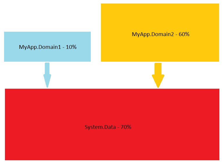
We saw why HSTs are useful but sometimes we want to know more. For example, is our application CPU or I/O bound? Or maybe we are interested in the application dynamics (e.g. when it is CPU bound and when it is I/O bound). Component interaction is also an important question for many of us. The software vendors of profiling tools recognize these needs and try to build better products. For example Microsoft provides Tier Interaction Profiling, Telerik JustTrace provides Namespace grouping, JetBrains dotTrace provides Subsystems, SpeedTrace offers Layer Breakdown and so on. While all these visualizations are useful, sometimes a simple diagram works even better.
The point is that there is no silver bullet. A single profiling data visualization cannot answer every question. I think ideas like Profiling Query Language (PQL) have a lot of potential. It doesn’t matter if there will be PQL or LINQ to some well established domain model (e.g. LINQ to Profiling Data). The language is only a detail. The important thing is that the collected data should be queryable. Once the data is queryable the developer can do the proper queries. Of course, each profiling tool can be shipped with a set of predefined common queries. I hope we will see PQL in action very soon 😉
First off, fantastic blog. I have enjoyed reading about your career path once finding it today. Sounds like you are having a lot of fun at your job!
Second, WOW! PQL sounds so cool! This would solve so many pain points I have with, say, DynaTrace. DynaTrace has its own proprietary data storage format, and I have no way to access it, and it stinks, because their query language supports only simple AND combinators and does not support negation.
Thanks. Indeed PQL is a cool idea. Unfortunately, most commercial software vendors rarely provides such means. I guess your best bet is with open source projects (if any). Another thing is that profiling tools are mostly used after a performance issue is found (post factum). Things like PQL can make automation much simpler and can be used to prevent performance problems. As a matter of fact, Microsoft ETW (https://msdn.microsoft.com/en-us/library/windows/desktop/bb968803%28v=vs.85%29.aspx) provides good querying capabilities and probably it is worth to look at it.